By Eddie Maiale, Graphic Design Intern
And we are back for round two! For those of us who have not read the previous post, following this link will bring you to part one in this three-part series covering Google’s material design. Previously, we covered what material design actually is, what Google means by the word “material,” and how motion should work in material design. This time we will cover style (color, imagery, typography, etc.) and layout.
Color throughout history has been a major factor in any design. Whether it be branding or simple infographics, color influences thought. We, as humans, communicate through the use of color. We want to engage the user to make them emotional or phlegmatic about something. Whatever emotion we want to communicate, whether it is happiness, humor, sadness, or excitement, it can be done with color. Material design limits the colors we can use, but they are diverse enough for us to create any type of message. Google suggests that we choose a color palette found on this page as each of the colors selected are said to work harmoniously with one another, making web application design much easier, especially for new designers as it gives them a template to follow. Although people may say that this is too limiting, I think it is good. It is only as limited as our artistic ability allows to mix and match colors. How we decide to use the colors is the important thing, not how many colors we can choose from.
The way to use these colors is to choose a primary color then an accent color. Our color scheme can be directly related to our brand or a mix of colors of our choosing. We want the primary color to be the dominating color, the most widely used color across all screens and the accent color should just be used for floating action buttons and interactive elements. Do NOT use the accent color as a substitute for our body text because it becomes lost in translation to the user, but using it for links is an acceptable use. A general rule of thumb when choosing to use the correct color is asking ourselves questions about how it looks, such as: Are these two objects overlapping? Can I read the text or is it hard to see on this background? Do my buttons have different colors from the primary colors in my application? Just ask yourself questions as if you were critiquing yourself.
Color Scheme:
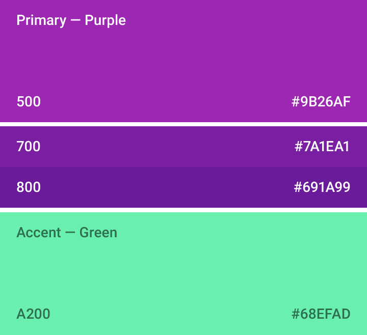
Example:
Icons are another integral part of web application design, or just web design in general. According to Google, all product icons should follow the “product icon grid” that was developed for consistency and give set rules in positioning graphic elements. The grid (below) will help create an icon that can be scaled up or down proportionally, while keeping sharp edges and correct alignment. As to keep consistent with previous mentions, we should not overcomplicate our icons, or make them too complex. An example of overcomplicating an icon is having three layers of shapes overlapping. This can get confusing and lose the users attention. Same thing goes for overlapping elements, two overlaps should be enough or else we run the risk of complicating the icon and losing focus. Although our icons are very important, so is imagery.
Product Icon Grid:
![]()
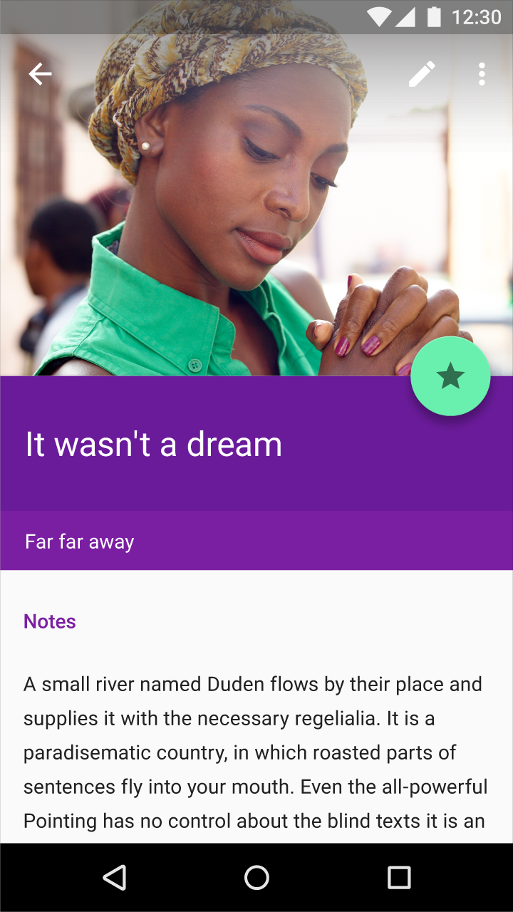
Imagery is what can be used to engage the user on a personal or in an informative way. Context and relevance are very important when choosing a specific piece of imagery for our application and in our design. For example, say we are on an application that shows us direction (north, south, east, west). We would expect to see a compass, or at least something similar. We would not expect to see an image of a tropical beach in the middle of summer; that would make no sense! Another tip: feel free to use all types of imagery (photography, illustration, etc) and experiment with the different types and see what looks most “natural” or genuine to us. Try to be authentic in our decision making, do not use stock imagery as it is inauthentic. Imagery should not be too busy either, it lacks focus and loses the users attention. There is a constant battle that all web developers/designers face with design and that is the issue of text over images, sometimes the color of text will not fit the image as it blends with the image. There is a simple solution to this and it is to create what Google refers to as “scrims” which are lightweight, translucent material layers, or quite simply, gradients and overlays. If we need text to show up on all images, just make a scrim appropriate to our situation. More information on scrims can be found here under the Text Protection section.
This is a good use of imagery:
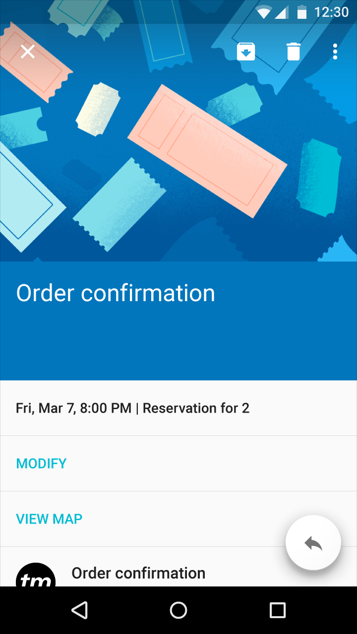
This lacks focus as the user must find the meaning:

Material design is guided by print-based design elements – such as typography, grids, space, scale, color, and imagery – to create hierarchy, meaning, and focus that immerses the user in the experience. This lays out the structure of a design in grids and templates to create familiarity and consistency across environments. Layouts are structured in material design by using a consistent set of units, detailed here to keep a similar feel between any designs we create to assist users and give a user friendly experience. Layouts of an interface should be separated by only a few sections at most, avoiding L shapes as much as possible. Creating whitespace in between sections clearly defines a new section and reads better for our purposes. When creating a layout, we should also keep in mind the optimal breakpoints (listed below) for responsive design to keep the design fluid and accessible.
Use this: 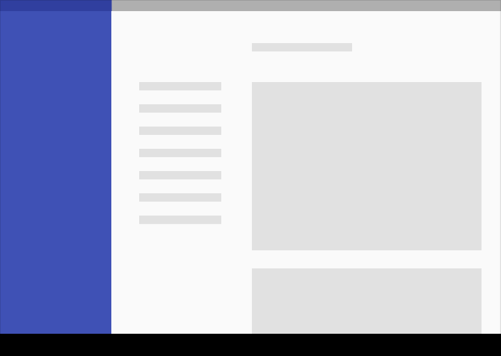
Rather than this: 
So today we learned about how styles and layouts can be very important in design, but we also learned how it fits into web applications and websites as a whole. We design these with the users experience in mind and we should always be thinking about how we can improve based on how users react. Next week will complete the series of three articles on “What is Material Design!”
