By Chloë Ayres, Head Designer
Nike. McDonalds. MasterCard. The marks of these brands are instantly recognizable, virtually worldwide, without even attaching a written brand name to them. Conventional design wisdom would dictate that a brand should pick one mark and stick with it, but is that still the case?
In this article on Creative Bloq, Ian Paget explores the idea of logo systems as the new corporate mark. The emergence of smart phones, he argues, has changed the way we think about logo design. Logos now need to have the consideration of “could this work as an app icon?” I would further argue that logos sometimes even change formats within a simple scrolling action on a responsive website. A successful mark now has to be instantly recognizable, and, at the same time, fluid.
So how are people accomplishing this successfully? Currently, logo systems are a relatively emerging trend, so there is still a fair amount of experimentation. Paget points to four examples of brands who he think have done it right.
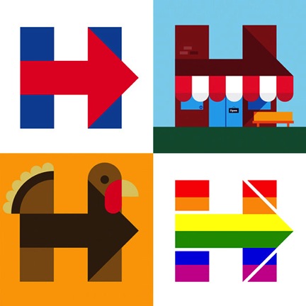
Hillary Clinton
Zocdoc

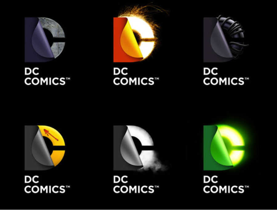
DC Comics
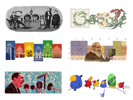
Google Doodles, while a successful attraction for the company, do not strike me personally as a “logo system” per se. True, the doodles do all mimic the Google logo in some way, but seen alone, printed, only the trained eye would be able to recognize them as Google marks.
To me, personally, there are two types of successful logo systems: a logo system that looks very analogous but is designed to go from full logo to just essentials for, say, a Twitter avatar, and a logo system that is designed to entice someone to “collect them all.”
A successful example of the first type of logo system, to me, is this system designed by Fuzzco for Lunch + Recess in Charleston, SC.
https://www.pinterest.com/pin/143552306846555005
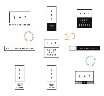
It has horizontal, vertical, square, and even spherical iterations, and they all look like they belong together. You could see one logo, and instantly recognize a different one as being from the same brand.
The second type of successful logo system, the “collector’s item” is something that I think could not be accomplished without omnipresent social media. I will say that I think it takes a loyal customer base to pull this off. Urban Outfitters famously changes its logo quite a bit, and would not be able to do so without making their customer base very aware of the change. A quick Google search of “Urban Outfitters current logo” brings up this page:
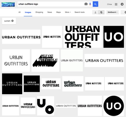
There are an insane amount of brand marks on that page. However, they keep the colors simple and consistent, do not add any extraneous marks, and keep the same target in mind.
Will logo systems stick around, or are they simply a trend? For now, it is hard to say. I think that logos definitely need more “wiggle room” than they used to, but some form of consistency in branding will always be a rule that it is important not to break. The designer in me is excited to see brands experiment with what it means to be recognizable, while the brand strategist in me is doubtful that rules are made to be broken. Whatever happens, I just hope I get to keep making them.
If you need a new logo or logo system, contact us at http://thegossagency.com/contacts/.