By Ryan Laffler, Account Manager/Digital Director
Have you ever thought about how certain colors make you feel? If you’ve ever gone into a job interview, you might have considered wearing red to come across as confident. But why red? Why do colors elicit certain emotions, and how can you apply this psychology to your brand?
Do Colors Affect All of us the Same Way?
The short answer is no. Most of us may agree that blue is a calming color, but that doesn’t mean that blue is intrinsically calming. As research shows, the way we interpret colors is largely based on our personal preferences, upbringing, and life experiences. Perhaps you associate the color green with comfort because your mother used to wear green frequently when you were growing up. Even though color doesn’t have intrinsic meaning, cultures can share a lot of the same perceptions based on how colors are frequently used in society, advertising, and other forms of media.
Colors and Branding
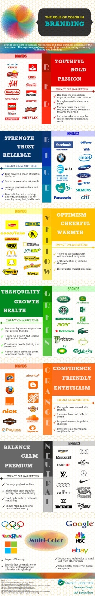
So what kind of impact does color have on branding? In a study called “Impact of Color on Marketing”, researchers found that up to 90% of snap judgments made on products can be based on color alone, depending on the product. That means that, on a subconscious level, we use our own personal perceptions of color to help us make decisions every single day. When a brand chooses its color scheme, it is important for the color to match the personality/culture of the brand. A study titled “Exciting Red and Competent Blue” found that the effectiveness of a brand’s color scheme depends on the perceived appropriateness of the color(s) being used.
A simple example is American Airlines, whose colors consist of red, white, and blue. That’s pretty straightforward.

Next, let’s take a look at Apple. The color scheme of white, silver, and sometimes black conveys a sense of elegance, sophistication, and futurism. The color scheme makes sense when tied into Apple’s overarching brand messaging and positioning.

A few years back, Berkshire Hathaway changed their logo from blue to purple. In the financial market, many institutions use the colors red and blue in their logos. Wanting to differentiate themselves while still remaining relevant to the perception of red and blue in the financial industry, they decided to combine both colors to make purple.
Old logo:

New Logo:

Below is an infographic with some other cool stats. One of our specialty services is branding. To learn more about what we offer please check out our branding services page.